

OTT Home Screen Design: The 10 Seconds That Decide Everything
OTT home screen design is the most consequential 10 seconds in the entire viewer experience. If someone lands on your home screen and doesn’t find something worth pressing play on within 10 seconds, they close the app. If they do find something, they’ll watch — and often keep watching for the next 45 minutes. Every serious streaming platform obsesses over this moment. Most independent OTT operators ship a home screen that looks like a video CMS admin panel.
Here’s the OTT home screen design playbook that actually drives watch time.
1. The Hero Placement Is Everything
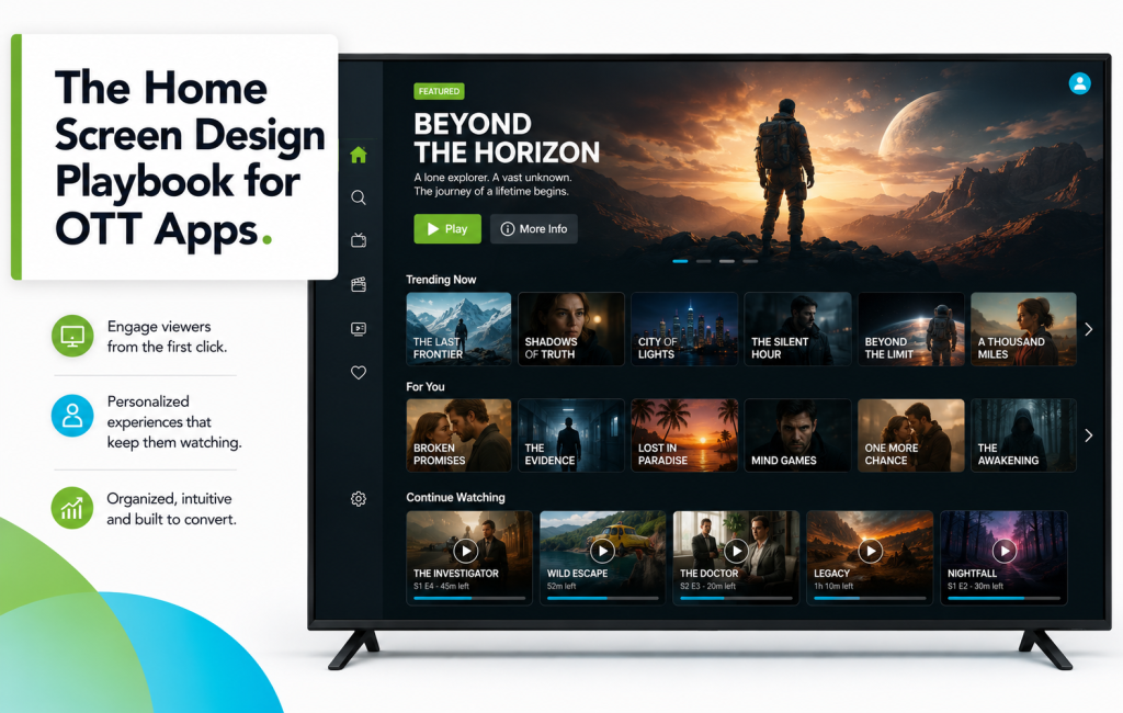
The top of the home screen — the “hero” area — is the single most valuable pixel real estate you have. It should:
- Feature one clear piece of content, not a rotating carousel of 10
- Autoplay a muted trailer or teaser (not a static poster)
- Show a bold title, a one-line description, and a prominent Play button
- Update at least weekly to give returning viewers a reason to come back
Rotating hero carousels feel active, but data consistently shows single-hero designs outperform them on engagement. One decision, made clearly, beats five decisions made hesitantly.
2. The First Content Rail Is Sacred
The first content rail below the hero is what viewers actually scroll past to find something to watch. Common winning options:
- “Continue Watching” — for return viewers, the highest-engagement rail there is
- “New This Week” — for content-heavy platforms, drives repeat visits
- “Trending Now” — social proof, useful when you have viewership scale
- “Recommended For You” — personalized, if your recommendation engine is strong
Test what wins for your audience. On most platforms, “Continue Watching” for return viewers and “New This Week” for new visitors outperform generic “Featured” or “Popular” rails.
3. Categorical Navigation Should Fit the Content, Not the Admin
Most OTT home screen design mistakes come from mirroring the internal content management structure to viewers. Your CMS might organize content by genre, production year, license window, and instructor. Your viewers care about mood, situation, and time — “Watch tonight,” “Quick 10-minute reads,” “For the kids.” Rebuild the categories from the viewer’s perspective.
4. Personalize as Early as You Can
Even a light personalization layer significantly beats a static home screen. Practical ways to start:
- Ask 2–3 preference questions during onboarding, then reflect them in the first rail
- Surface “Because you watched X” once a viewer has completed two full pieces of content
- Reorder rails based on what the viewer engaged with last time
- Hide categories they’ve never touched after their first month
5. The Below-the-Fold Rails
Below the first rail, most OTT home screen design becomes a scroll-through. Good structure:
| Rail Position | Purpose |
|---|---|
| Rail 2 | Continue Watching (if not Rail 1) |
| Rail 3 | New This Week |
| Rail 4 | Curated collection (staff picks, themed set) |
| Rail 5 | Genre or category rail #1 |
| Rail 6 | Genre or category rail #2 |
| Rail 7 | Deep catalog rails (older content, niche interests) |
6. Thumbnails Do More Work Than Titles
OTT home screen design lives or dies on thumbnail quality. Netflix’s thumbnail testing is famous because it works. Basic principles:
- Faces beat objects, especially for character-driven content
- High contrast beats muted palettes
- Titles overlaid on the thumbnail almost always improve tap-through
- Test at least three thumbnail options per major piece of content
7. Different Devices Deserve Different Layouts
OTT home screen design isn’t universal. A great mobile home screen is different from a great TV home screen:
- Mobile: Vertical scrolling, fewer rails, tighter thumbnail grid, prominent search
- Tablet: Balanced between mobile and TV — more rails visible per screen
- TV: Horizontal navigation, larger hero, immersive autoplay backgrounds, remote-friendly
- Web: Similar to TV but with hover-preview interactions
Testing Your OTT Home Screen Design
You can’t optimize what you don’t measure. The metrics that matter for OTT home screen design:
- Time to first play — how long from home screen open to press-play
- Bounce rate — percentage of home screen visits that end without a play
- Rail engagement rate — which rails get scrolled past, which get clicked
- Hero play rate — how often the hero title actually gets played
Watch these numbers weekly. Small home screen changes can produce double-digit engagement lifts.
Ready to redesign your home screen? Start your free trial today and configure your app home screen without touching a line of code.